I may have a new favorite web part in SharePoint 2010—at least it’s my favorite for a while. J I am a bit of an Excel fanatic. I love drilling down into data to gain obscure business intelligence. I love pivot tables, and I love graphs—although I’ll admit I’m much better at pivot tables than I am graphing. It’s easy to get caught up in displaying your data in Excel—it becomes much more like playing Excel than working with Excel. The new Chart Web Part is one of those fun web parts that you can get caught up in playing with but it also solves the common business problem of, “How can I quickly display a chart of some data on my SharePoint page?” Note: This post and all scresnshots are from the Technical Preview and things may change before SharePoint 2010 is released to the public.
Excel services is a great way to render charts in SharePoint, just set up the chart in Excel and then add an Excel Services web part to display the named chart from your published spreadsheet. But with the Chart Web Part, you can not only chart information from your Excel Services spread sheets, but also from any SharePoint list. And best of all, you configure everything in your browser!
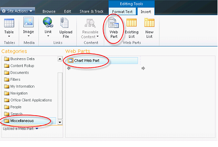
Adding the Chart Web Part to a Page
You’ll find the Chart Web Part in the Miscellaneous category and you add to your page just like you would any other web part by selecting it and clicking the Add button.
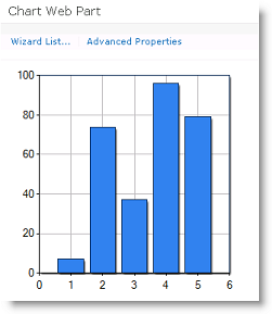
You will see that SharePoint 2010 adds the web part and it displays a new chart based on some random data.
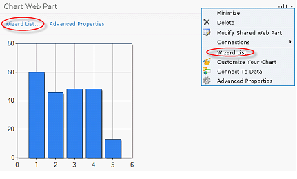
Configuring the Chart Web Part
With most web parts, you expect to configure them in the tool pane, although you can certainly do that by clicking on Modify Shared Web Part, you will probably want to use the wizards to configure it. You can access the list of wizards by clicking on Wizard List.
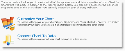
The Chart Web Part Wizards
There are two wizards: one to Customize Your Chart, and one to Connect Chart to Data. We’ll begin by using the Connect Chart to Data wizard and then we’ll customize our chart later.
The Connect Chart to Data Wizard
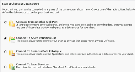
The first step in the wizard is to choose a data source. Notice that you have the options to Get Data From Another Web Part, Connect To a Site Definition List, Connect to Business data Catalogue, and Connect to Excel Services. This is a nice set of options. I have some Sales Data in a SharePoint list and that’s what I want to chart, so I’ll select the option to Connect to a Site Definition List.
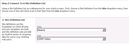
In the second step of the wizard, I select the site where my data is stored and the list. Both of these are displayed in drop-down list boxes and I can select lists and libraries anywhere in my site collection—not just the one I’m currently working in, which is a very nice feature.
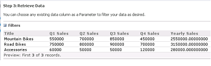
In the third step of the wizard, it shows me a preview of the data that is available for charting. Here is what it shows me for my 2009 Sales list:
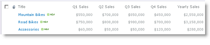
Here is what the SharePoint list looks like if you view the default view directly:
In the fourth and final step of the wizard, I bind the chart to the data. You’ll notice that there is an impressive set of options—you can configure this connection in almost any way you can imagine.
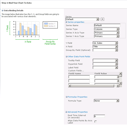
For this blog post I used 4 series that were each set up to display a unique quarter (Q1 Sales, Q2 Sales, Q3 Sales, and Q4 Sales). You can’t see these all at once, so I’m not adding screenshots. I didn’t add any other Data Point fields, Formulas, or change the Advanced Properties. At this point, I had finished the Connect Chart to Data wizard. I could see my data displayed in the Chart Web Part.
It was nice to see my chart rendered so quickly, but I wanted to change the way it looked, so I ran the Customize Your Chart wizard.
The Customize Your Chart Wizard
This is the wizard that will allow you to change the way your chart looks. Once again, you have a very impressive number of options here.
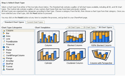
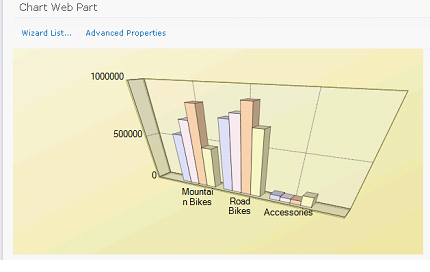
The first step is to select a chart type. I counted 158 different types of charts! You have two dimensional and three dimensional charts in types of column, bar, area, line, point/bubble, financial, pie, radar, polar, gantt/range column, range, error bar, box plot, funnel, and pyramid. I know that with this set of options, it’s kind of boring, but I selected the Column with Perspective as my chart type. It just seemed appropriate for this kind of sales data.
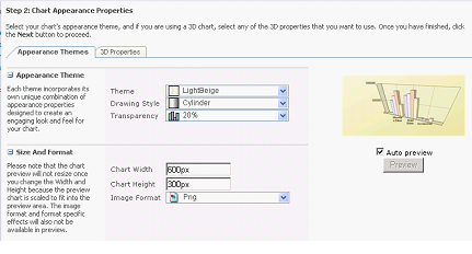
In step two I changed the appearance of the chart. There are 12 themes you can choose from: Bright Pastel, EarthTones, LightSteelBlue, GreyScal, SemiTransparent, ExcelLike, LightBeige, Berry, Chocolate, Fire, GreenBlue, and Custom. I selected the LightBeige just because I liked it. For Drawing Style, you can select from Default, Cylinder, Emboss, LightToDark, and Wedge. I selected Cylinder. Transparency can be set from 0% – Solid to 100% – Invisible. I left it at the 20% default. For the Size and Format I could set a cusome chart width, chart height, and even image format (JPG, BMP, or PNG)—I left all three of these set at the defaults. One of the things I really like about the Chart Web Part is that it generates an actual image on the page and not something that is rendered by AJAX or ActiveX or SilverLight. Since it’s an actual image, I can easily copy and paste it into another document, or email, or even save the image if I want.
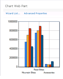
At this point I’m finished with both of the wizards and I can see my finished chart on the page
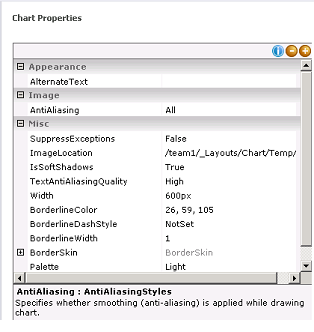
Advanced Properties
The only thing I haven’t shown you yet is the Advanced Properties. If you click on this link, you can view a properties dialog where you can change various properties of the image itself like antialiasing, shadows, border line colors, and much more.
So, what are you waiting for? You know you want to play some at work, so go ahead and add a Chart Web Part to your SharePoint 2010 site and start playing around. You can tell your boss I said it was OK. J